
DESIGN
I've always liked the visual arts. From as early as grade school, I was completely certain I would grow up to be an illustrator. I learned Photoshop and Illustrator in high school just to make comics with friends and design posters for mediocre punk shows.
I never pursued design professionally, but I've been fortunate in that it's always found its way to me.
I think writing and design are two sides of a coin. They both direct communication in ways the other is unable to do.
ABOUT
CSS UPDATES
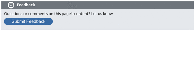
In documentation, it’s inevitable that you’ll need some kind of CSS component for notification and info callouts (and it’s also inevitable that your docs will become overrun with them if you’re not careful). Given the way they proliferate like weeds, I think it’s important to make them visually minimalist and non-distracting.
At a previous job, I created a series of notifications with minimalist themes that didn't detract from the content of the page, and I still contend that they're as clean as the best callouts you'll find.
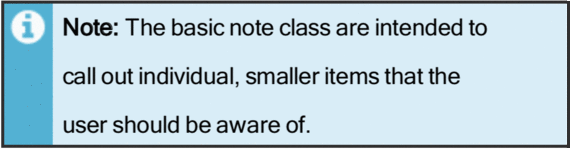
It’s also worth mentioning that the video boxes and the documentation feedback tools I created both used similar formatting, albeit with the contrast stripe running horizontally rather than vertically. Aesthetic consistency is a critical component to a company's brand.

I love working with Adobe Illustrator, and would love to spend even more time in it if I could. Given that documentation often exists at the nexus of communications, I sometimes hear someone from engineering or marketing ask if I can update an old diagram, or redo an outdated graphic that resembles a cave painting.
The following represent some "before and after" images.
(With that in mind, be aware that means the first image is the preexisting monstrosity I had to help vanquish.)


